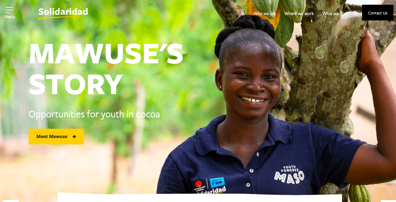
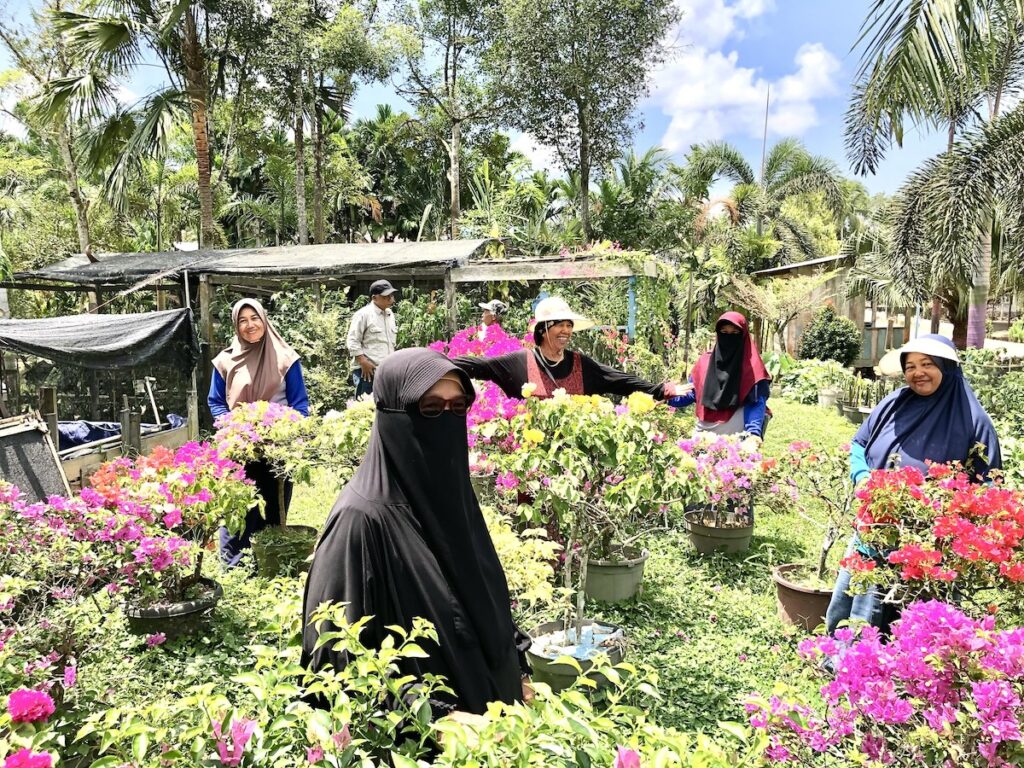
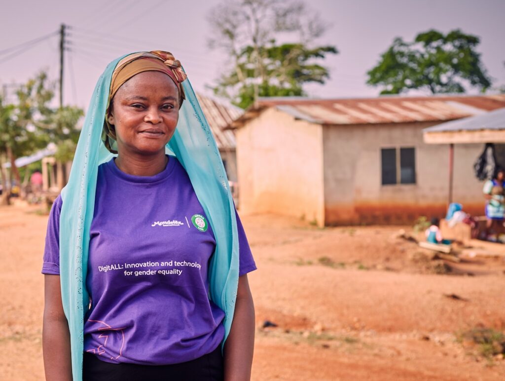
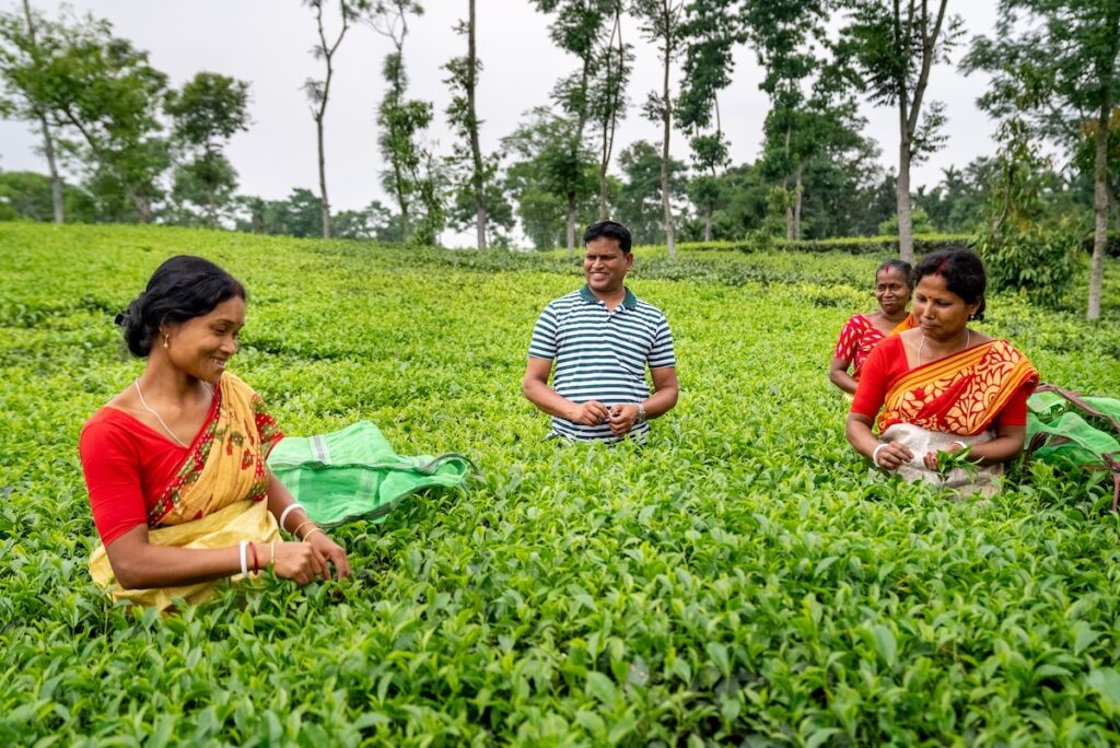
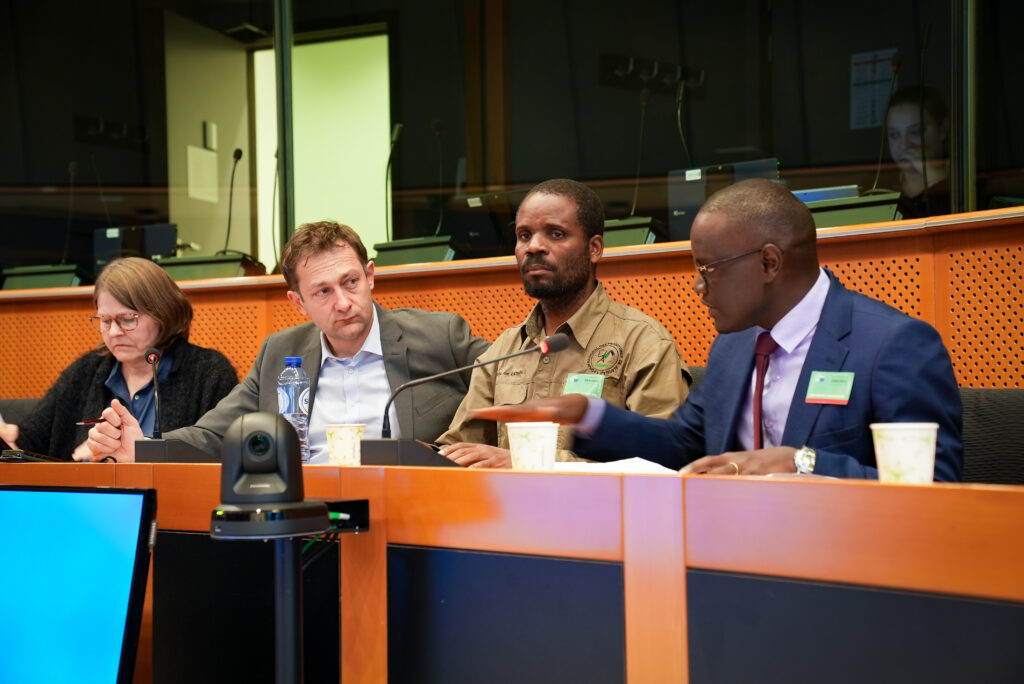
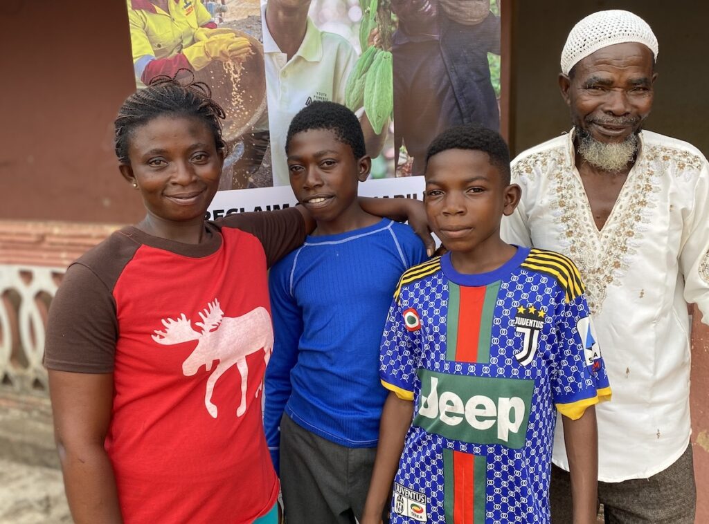
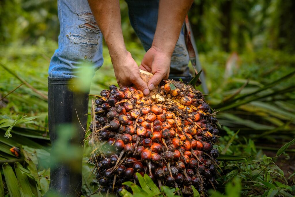
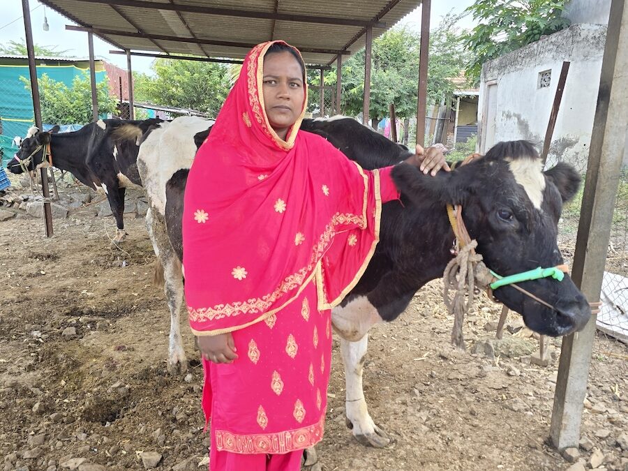
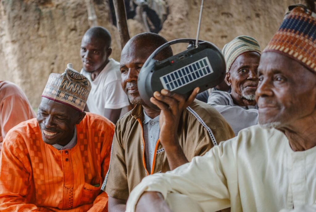
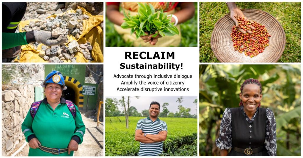
Amplifying and centering the voice of smallholder farmers, workers, and artisanal miners is central to creating an economy that works for all. Redesigning the website provided a fresh opportunity to help this commitment shine through.
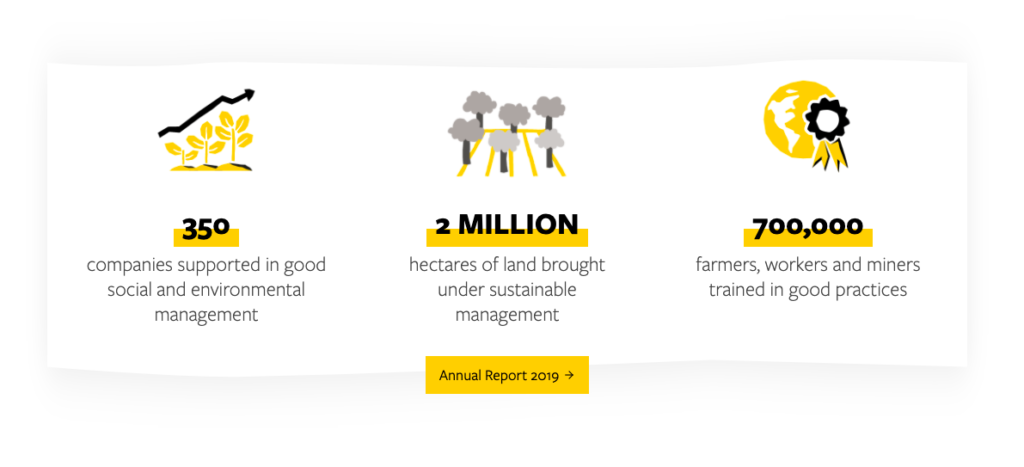
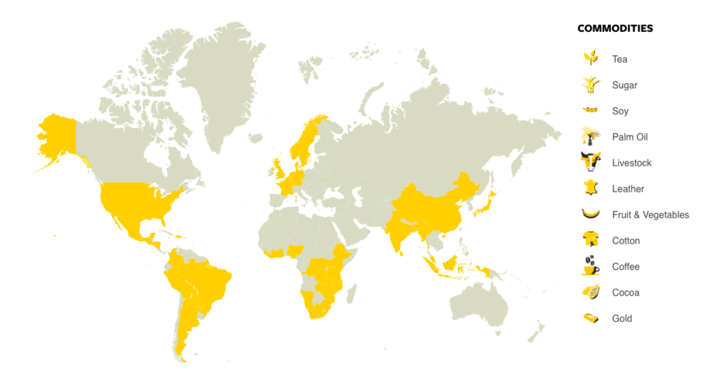
Farmer stories are interwoven throughout the website, along with an increased emphasis on impact and data, and easy to navigate connections between different regions, themes, and commodities. The new design also lends greater consideration to the needs and interests of our visitor. Whether you’re a producer, an existing or potential partner, a concerned citizen, or curious student, there is something here for you.
Sharing our vision with you
Declaring the purpose, vision, and strategy of our work is front and center in the new website. Simpler, bolder language helps to convey our work with clarity and meaning, while a straight forward architecture eases navigation and exploration.
We also made it easier for you to contact the right people, if you like to partner with us.
Ease of navigation and exploration
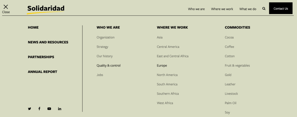
Exploring our work has never been easier. The top navigation provides a clear starting point, while the detailed dropdown menu gives a simple overview of the scope of our work. For those ready to dig even deeper, a filtered news page allows readers to sort by interest areas.

But, some things haven’t changed
With all the exciting new changes, you’ll find some things haven’t changed at all. You can still expect the same global content putting producers first, and the pragmatic, optimistic yellow and black colors.
Please explore, enjoy, and share your feedback! Love it? Something else you’d like to see? Caught a typo? We want to know how the new website is working for YOU! Please contact Libby Daghlian for any feedback you may have on our website.

